
To improve safety in your low vision kitchen, use high-contrast colors like red, yellow, or orange on tools, cutting boards, and containers to make items easier to distinguish. Organize everything in consistent spots and label objects with bold, large-print labels or tactile markers. Incorporate patterned surfaces and contrast-enhanced utensils to prevent slips and mistakes. If you want to learn more about these helpful contrast tricks, keep exploring ways to make your kitchen safer and more accessible.
Key Takeaways
- Use high-contrast colors on utensils, cutting boards, and containers to distinguish items easily.
- Organize kitchen tools and ingredients in consistent, labeled places for quick identification.
- Incorporate tactile markings and patterned surfaces to enhance recognition and safety.
- Ensure proper lighting with adjustable task lights to highlight contrast and reduce shadows.
- Avoid clutter and maintain clean surfaces to prevent confusion and accidental spills.

Low Vision Black and White Cutting Board – Small
Solid, heavy construction
As an affiliate, we earn on qualifying purchases.
As an affiliate, we earn on qualifying purchases.
What Challenges Do People With Low Vision Face in the Kitchen?

Living with low vision in the kitchen can make everyday tasks more difficult and sometimes dangerous. Your visual perception is limited, making it harder to distinguish objects, read labels, or see small details. This can lead to mistakes like cutting food incorrectly or missing hazards. Spatial awareness becomes a challenge as well, causing difficulty in judging distances or understanding the placement of items on counters and stovetops. You might accidentally knock over containers or struggle to align utensils properly. These obstacles increase the risk of spills, burns, or cuts. Because your eyes don’t provide clear, detailed information about your environment, you need to rely more on touch, sound, and memory. Implementing contrast tricks such as using contrasting colors and textures can significantly improve safety and ease of task completion. Recognizing these challenges is the first step toward creating a safer, more accessible kitchen experience.

Talented Kitchen Labels for Food Containers – 135 Count, Preprinted Black Cursive on Clear Backing, Water-Resistant – Pantry & Kitchen Storage Labels for Jars & Bins – Easy Peel & Stick
Elegant Organization: Transform your kitchen with Talented Kitchen's black cursive pantry labels. This comprehensive set of 135 labels…
As an affiliate, we earn on qualifying purchases.
As an affiliate, we earn on qualifying purchases.
How to Use High-Contrast Colors for Safer Food Preparation?

Using high-contrast colors can make food preparation safer and easier. You can choose bright, visible colors for cutting boards and containers, and use color-contrasted utensils to distinguish different tools. Color coding food items helps you quickly identify ingredients and reduce mistakes in the kitchen. Incorporating car protection accessories, such as brightly colored covers or labels, can also serve as visual cues to improve safety and organization. Additionally, selecting visual aids and color schemes designed specifically for low-vision users can further enhance safety during meal prep. Employing contrast-enhancing techniques can make a significant difference in preventing accidents and ensuring a safer cooking environment. For example, incorporating regional cultural elements into your kitchen decor can improve familiarity and comfort, aiding in safer navigation. Using contrast techniques with familiar regional patterns can also help identify different zones within the kitchen more easily.
Choosing Bright, Visible Colors
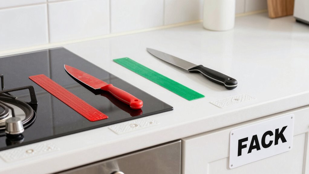
Choosing bright, visible colors is one of the simplest ways to make your kitchen safer for low vision. Your goal is effective color selection that enhances contrast and makes items stand out. Use bold, vivid hues like yellow, orange, or red for cutting boards, containers, and appliances. These colors create contrast techniques that help you quickly identify tools and ingredients. To visualize, consider this table:
| Bright Colors | Contrast Techniques | Common Items |
|---|---|---|
| Yellow | High contrast with dark surfaces | Cutting boards, measuring cups |
| Red | Stands out against neutral backgrounds | Knives, utensils |
| Orange | Visible on various countertops | Storage containers |
Incorporating contrast techniques like these is a key component of effective personal safety strategies. The use of high-contrast colors can significantly reduce mistakes and improve overall confidence during food preparation. Additionally, selecting colors that are easily distinguishable can help prevent mistakes and increase confidence during food preparation.
Using Color-Contrasted Utensils
To enhance safety during food preparation, selecting utensils with high-contrast colors can make a significant difference. Using utensils with strong color contrast improves utensil visibility, making it easier to identify and handle them safely. Opt for tools in colors that stand out against your background, such as dark utensils on a light countertop or brightly colored spoons. This contrast reduces the risk of accidentally grabbing the wrong utensil or misplacing them. Keep a set of utensils in bold, easily distinguishable hues for quick recognition. Consistently using high-contrast utensils helps you stay aware of their location, preventing slips, cuts, or cross-contamination. Understanding visual accessibility features in choosing accessible kitchen tools ensures that safety measures align with personal needs and preferences. Incorporating tools with contrast-enhanced designs can further improve your ability to differentiate items quickly and accurately. Regularly practicing safe handling techniques with these tools can reinforce safe habits and reduce accidents. Additionally, selecting utensils with ergonomic handles can improve grip and control, further enhancing safety. By choosing color-contrasted tools, you create a safer, more efficient kitchen environment tailored to your low vision needs.
Color Coding Food Items
How can you make food identification safer and more efficient? One effective method is color coding food items using high-contrast colors. This improves color differentiation and provides clear visual cues, making it easier to distinguish between different foods at a glance. For example, use red for raw meats, green for vegetables, and yellow for cooked items. Bright, contrasting colors help your eyes quickly recognize food types, reducing mistakes during preparation. Consistently applying these color codes creates a reliable system that minimizes confusion and enhances safety. By establishing distinct visual cues, you make the kitchen more accessible and safer for low vision. Understanding basic color contrast principles can help you choose the most effective color combinations for your system. Additionally, incorporating sound cues or tactile markers alongside visual cues can further improve safety and confidence in food handling. Recognizing the importance of high-contrast color schemes is essential for creating an effective and accessible kitchen environment. Using consistent labeling practices can also strengthen your visual cues and prevent errors. Incorporating vetted strategies from experts ensures that your system remains reliable and effective in promoting safety.

Seimneire 170 Pcs Black Removable Labels
File organization: Label stickers are commonly used in office settings to organize files and folders. By attaching label…
As an affiliate, we earn on qualifying purchases.
As an affiliate, we earn on qualifying purchases.
Choosing the Best Cutting Boards and Utensils for Visibility?

Choosing the right cutting boards and utensils can greatly improve your kitchen safety. Look for high-contrast materials and bright colors or patterns that make items easier to see. These choices help you identify tools quickly and reduce the risk of accidents. Incorporating essential tools and tips for craft and design projects into your kitchen setup can also enhance visibility and organization. Additionally, selecting items with high-contrast surfaces can further aid in distinguishing different tools at a glance. Incorporating visual contrast into your kitchen tools can make a significant difference for those with low vision. Considering the role of AI Ethicist Jobs in developing ethical guidelines for smart appliances can also contribute to safer kitchen environments. Integrating smart kitchen appliances that provide visual alerts or enhanced lighting can also support safer use for those with low vision.
High-Contrast Materials Selection
Selecting high-contrast materials for your kitchen tools can substantially improve your safety and efficiency. Focus on color matching; choose cutting boards and utensils in bold, contrasting shades like deep blue or black paired with white or light-colored handles. This makes it easier to distinguish tools at a glance. Material durability is also key—opt for sturdy, long-lasting options such as high-quality plastics or stainless steel that resist chipping and warping. These durable materials maintain their contrast over time, ensuring consistent visibility. Avoid tools with dull or similar tones that blend into the background. By selecting high-contrast, durable materials, you reduce the risk of mistakes and make everyday tasks safer and more manageable.
Bright Colors and Patterns
Bright colors and patterns can make your kitchen tools stand out, making them easier to find and identify quickly. Choosing utensils and cutting boards with colorful patterns enhances visibility and supports better pattern recognition. Look for items in bold, contrasting colors like red, yellow, or blue, which stand out against typical kitchen backgrounds. Patterned handles or surfaces help you distinguish different tools at a glance, reducing mistakes during food prep. When selecting cutting boards, opt for those with vibrant borders or markings that clearly define edges and cutting zones. Using bright, patterned utensils and boards minimizes confusion and increases safety, especially when your vision is limited. Incorporating these visual cues helps you stay organized and confident while working in your kitchen.

Kitchen Utensils Set-Umite Chef 34 Pcs Silicone Cooking Utensils Set for Nonstick Cookware-Silicone Spatulas Set, Stainless Steel Handle-White Kitchen Gadgets Tools, Pots and Pans Accessories
EVERYTHING YOU NEED From the everyday kitchen spoons to the garlic crusher, we included all the kitchen stuff…
As an affiliate, we earn on qualifying purchases.
As an affiliate, we earn on qualifying purchases.
Organize and Label Your Kitchen to Improve Contrast and Safety?
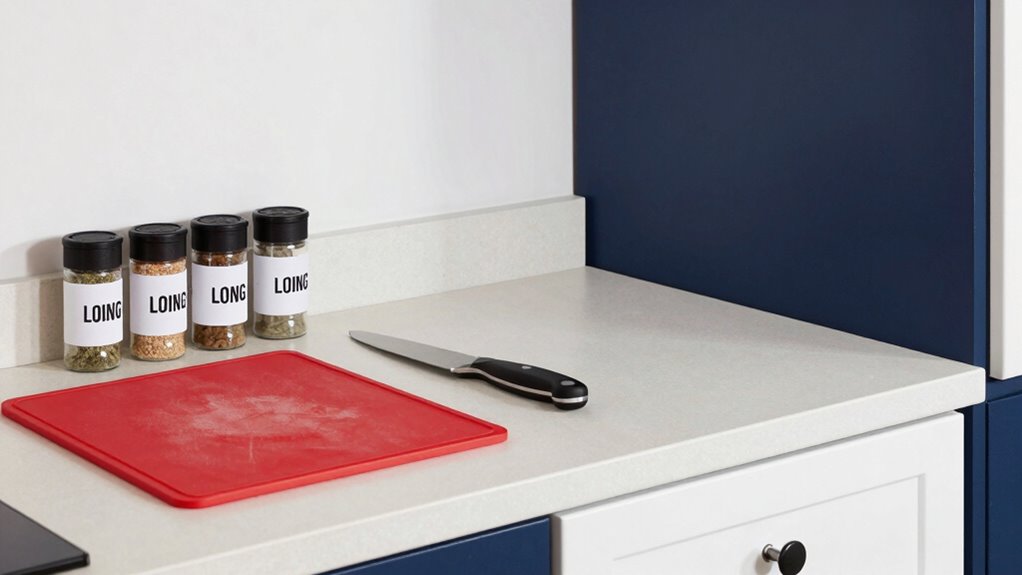
Organizing and labeling your kitchen can make a substantial difference in safety for those with low vision. Proper kitchen lighting highlights contrast and helps you see clearly, so ensure your workspace is well-lit with adjustable or task lighting. Use storage solutions that keep items in consistent places, reducing the need to search blindly. Clear, labeled containers simplify identifying ingredients and tools, preventing mix-ups. Consider using large, bold labels with high contrast colors to make them easy to read. Group similar items together and store frequently used items within easy reach. This organized approach minimizes confusion, reduces accidents, and boosts confidence while cooking. Small adjustments like bright labels and strategic lighting can considerably improve safety and independence in your kitchen.
Common Mistakes to Avoid When Applying Contrast Strategies?

While using contrast strategies can considerably improve safety, many people make common mistakes that undermine their effectiveness. One mistake is creating visual clutter around contrasting areas, which can make important cues harder to identify. Overloading your kitchen with too many contrasting colors or patterns can cause confusion, increasing the risk of accidents. Additionally, neglecting to address accidental spills promptly can lead to slippery surfaces that contrast poorly with the rest of the floor or counters, making cleanup harder. Another error is relying solely on color contrast without considering texture or tactile cues. These mistakes reduce the benefits of contrast strategies and can compromise your safety. To avoid this, keep your contrasting elements simple, focused, and free of visual clutter, and always clean spills immediately.
Essential Tools and Resources for Low Vision Kitchen Safety?

To enhance safety in your low vision kitchen, having the right tools and resources is essential. Adaptive technology, such as talking labels, magnifiers, and kitchen timers with auditory alerts, can make tasks easier and reduce errors. Ergonomic design also plays a key role—tools with comfortable grips, non-slip mats, and easy-to-use utensils help prevent accidents. Bright, contrasting color-coded gadgets allow you to identify items quickly, while textured surfaces improve tactile feedback. You might consider installing tactile markings on appliances and using large-print or high-contrast labels for clarity. These resources empower you to navigate your kitchen more confidently and safely, minimizing risks and improving independence. Investing in adaptive technology and ergonomic tools creates a safer, more accessible environment tailored to your needs.
Frequently Asked Questions
How Can Lighting Adjustments Enhance Contrast Without Causing Glare?
You can enhance contrast by adjusting your lighting placement to minimize glare reduction. Position lights so they illuminate work surfaces directly without creating harsh reflections that cause glare. Use diffused or indirect lighting to soften brightness, helping you see details clearly. Proper lighting placement guarantees even illumination, improving contrast and safety without the discomfort or visual confusion glare can cause. This simple tweak makes kitchen tasks safer and more comfortable.
Are There Specific Color Combinations Recommended for All Types of Low Vision?
You should focus on high-contrast color pairing, like dark plates on light surfaces or bright utensils against muted backgrounds, to improve visibility. Incorporate texture differentiation by using tactile cues, such as embossed labels or varied surface textures, to help you identify items easily. These strategies work well across different low vision conditions, making your kitchen safer and more accessible. Consistently applying these color and texture tricks reduces mistakes and boosts confidence while cooking.
How Often Should Contrast-Enhancing Tools and Products Be Replaced or Maintained?
You should verify and substitute contrast-enhancing tools and products based on their product lifespan and your maintenance schedule. Regularly inspect for wear, fading, or damage, and clean them according to manufacturer instructions. Typically, you might need to replace items every 6 to 12 months, but it varies. Staying proactive ensures peak visibility, safety, and effectiveness, so set reminders to review and maintain your contrast tools regularly.
Can Contrast Strategies Be Customized for Different Types of Low Vision Conditions?
Yes, you can customize contrast strategies for different low vision conditions by using personalized contrast options and adjustable strategies. You should assess your specific needs and modify lighting, color contrasts, and tactile cues accordingly. Experiment with different tools like non-glare lighting or color filters to find what works best. Personalized contrast ensures better visibility and safety, making your kitchen more accessible and reducing mistakes.
What Safety Precautions Should Be Taken When Using Contrasting Kitchen Tools?
When using contrasting kitchen tools, always guarantee sharp utensils are clearly distinguished to prevent accidents. Use high-contrast colors for handles and blades, and keep sharp tools stored safely when not in use. Maintain stove safety by using contrasting pot handles for easy identification and turning off burners promptly after cooking. Stay alert, avoid clutter, and double-check your tools’ visibility to reduce the risk of cuts and burns.
Conclusion
By applying simple contrast tricks, you can make your kitchen safer and more navigable. Nearly 70% of people with low vision report accidents due to poor visibility, highlighting the importance of these strategies. With the right colors, organized tools, and clear labels, you’ll reduce mistakes and boost confidence in your cooking. Take control today—your safer, more accessible kitchen is within reach, ensuring you enjoy cooking without unnecessary risks.